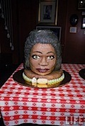
 Cake Wrecks is a blog celebrating the worst, most inept, and the most unappetizing in the world of cake decoration. Here you’ll find day-glo coloring, plastic ornamentation, and all manner of creative misspelling applied to ceremonial desserts. Occasionally, the site even features an example of a decorator who really got it right. (Is Oprah here an example of the former or the latter? That’s up to you.)
Category Archives: Pen and Link
Jennifer Meastre’s Pencil Sculptures
 Ms. Maestre sculpts incredible pieces made from sharpened pencils. They look like something you might find at the bottom of the sea, if the sea were made of sharpened pencils.
James Gurney’s Blog
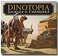 James Gurney is the author/illustrator of the Dinotopia series. He draws and paints like a son of a gun. His rough sketches make my finished pieces look like dog barf. Plus, I met him at a book signing last year and he’s really nice. His blog is a phenomenal reference for all things illustrated. You should probably be reading it right now instead of this.
Vonnegut on “Writing With Style”

Here’s a great essay by Kurt Vonnegut on writing with style. He breaks it down into seven simple steps. My favorite is number seven: “Pity the readers”. Lord, how I pity my readers.
What Do I Put In My Portfolio?
 Irene Galo, an art director at Tor Books, has posted a good, common sense primer on putting together a portfolio. It covers tips on content, knowing your audience, your competition, and even minding your manners. Excellent advice, and a definite bookmark for all illustrators.
Thsrs

Ernest Hemingway once wrote a story in six words, and claimed it was the best thing he ever wrote. None of the words was more that two syllables long.
If you’d like to write like Hemmingway, try “Thsrs”. It’s a thesaurus that only returns shorter, simpler words.
Finding Value in a World of Free Stuff
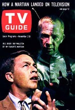 The modern internet is little more than two decades old, but we’ve adapted fast. Concepts that might have seemed preposterous a generation ago – instantaneous global communication, for example, or Google searches – have quickly become a part of everyday life. It’s been a remarkably smooth transition, for the most part.
But for people who create content, things have been a little bumpier. Artists, writers, musicians and other creative types have found that we need to rethink the rules for what we make. Our audience has new expectations. Digital content is immediate, abundant, easily archived and shared, and pretty much everyone wants it for free.
But what is free content worth? What, for example, is Pen & Link worth? I’ve been thinking about this a lot.
Colored Pencils as Reviewed by a Computer Magazine
This cracked me up. Then again, I’m a geek.
Nicole Gastonguay
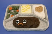 Remember the shock of seeing your third grade teacher in the supermarket … with her husband? This was how I felt when I discovered that Nicole Gastonguay, the graphic designer at Walker and Co. who so carefully crafted my Backbeard and Lion’s Share books, has a life of her own. She sews Salisbury steak. Also, hot dogs and spray can cozies. Who knew? Be sure to check out her gallery.
How They Made HBO In The Old Days

Recently, I was talking to my illustration students about what it was like back in the dark ages, before Photoshop and Illustrator ruled our world. One of my students asked how they managed to do the all the stuff they did before they had computers. I could think of no better example than this video, a making-of featurette on the “new” HBO TV intro from 1983.
Al Jaffee’s Fold-in’s
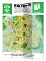 If you ever read MAD magazine as a kid, you know Al Jaffee. He creates the amazing fold-ins on the inside of the back cover, the pictures (and captions) that magically transform once the image is folded in thirds. If you’ve never experienced the fun of one of Mr. Jaffee’s fold-ins in person, now you’re in luck.
Saul Bass and Paul Rand
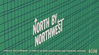 If you’re a student of design, you know these names well. What you may not know is that these two titans of graphic design history also dabbled in picture books, and there are a couple of interesting examples online.
The Mystery of the Face on the Cake
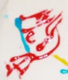 For years a man’s father has been drawing a peculiar doodle on birthday cakes and cards. Is it a face? It sort of looks like a face, but not really. There might be a hat, but where are the eyes? Is that an ear or a nose?
Don’t panic! The decades-long mystery has now been solved, and it’s a fun, surprising read. No skipping ahead and peeking at the end.
A Few Freelancing Tips
For all the readers out there who either 1) are working in the field as writers or illustrators, or 2) aspire to do so some day, here are a few helpful links aimed at the professional side of things.
17 Tips for Freelancers:
http://megillustrations.typepad.com/…
Chris Garret: “My Top 5 Biggest Freelancing Mistakes”:
http://freelancefolder.com/my-top-5…
How to disarm 10 difficult client observations/requests:
How to Draw a Head
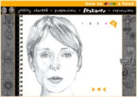 The Academy of Art University has posted an online class on drawing the human head. It covers different expressions, proportions, shading, etc. in a straightforward, easy-to-follow way. There’s even a nice interactive section at the end where you can dial up different expressions on the model and fade back and forth between the sketches and the actual photo.
