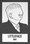
 Mrs. Pruneface! Diet Smith! Pearshape! Vitamin Flintheart! They’re all here.
Chester Gould was a maniac illustrator. What an imagination.

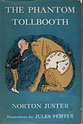 Big Think has a terrific video interview with the legendary Jules Feiffer, author, political cartoonist, and children’s book illustrator.
In the children’s book world, Feiffer is probably best known for his work on Norton Juster’s classic The Phantom Tollbooth. Earlier in my career I got a job illustrating a version of Tollbooth for a textbook series, and working in Feiffer’s shadow was an impossible mission. Not only didn’t I have his talent, but I also didn’t know his secret of drawing with a pointed stick he got from the butcher. (Not that it would have helped.)
In his eighties now, Feiffer is still going strong, and it sounds like he and Juster have a new book out this fall. I’ll be the first in line to pick it up.
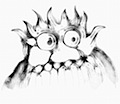 Lately, I’ve been playing around with these two cool online drawing tools that have been wasting far too much of my time. Flame wins in terms of bells and whistles, but I think Harmony is still my favorite. There’s something about the way that it automatically sketches in the corners and darkens the lines that’s fascinating. I’d love to do a whole book in this style.
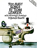 Drawn! has a nice write-up about Ronald Searle turning 90. Searle has always been one of my favorite illustrators ever since I saw his work in a collection of Tom Lehrer songs years ago. Searle has a way with his line that’s truly magnificent, and it’s heartening to see he’s still going strong.
Searle is among a proud tradition of illustrators who continued to work well into their tenth decade including Al Hirschfeld (99) and William Steig (95). These guys are my heroes.
Be sure to check out the video…
 Working on the Benjamin Franklinstein books with Larry over the past year or so, inventors have been on my mind a lot. That’s why it was so interesting to come across these samples of letterhead from two of history’s greatest, Thomas Edison and Nikola Tesla. The two were not great friends, and it’s interesting to see how their personalities came across in the way they chose to correspond with the public. (I know which one I’d rather receive a letter from.)
 A deckle edge is when the pages of a book are cut in a ragged way so that they seem to be trimmed by hand. Turns out the tradition of creating those edges is pretty interesting:
The deckle edge dates back to a time when you used to need a knife to read a book. Those rough edges simulate the look of pages that have been sliced open by the reader. The printing happened on large sheets of paper which were then folded into rectangles the size of the finished pages and bound. The reader then sliced open the folds.
There’s a great article on this tradition at:
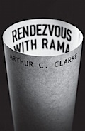 I have a tendency to make every project more complicated than it needs to be. I think that’s why these re-imagined cover designs for classic science fiction books are so appealing. Each one was created by hand on a single sheet of white paper, then photographed. No fancy computer tricks, expensive software, or any of that jazz. These are stunning.
 If a writer wants to use a gender-neutral pronoun to write a sentence, what should he/she/they use? Despite its many virtues, the English language doesn’t have a good solution to this problem.
It’s complicated, but maybe it doesn’t need to be. The New York Times On Language column tackled this recently, and the story behind why we traditionally use he might surprise you…
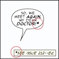 Let’s say you’re writing a comic, and you want to indicate that your character is out of breath and speaking French from the other side of a closed door. How do you do it?
Nate Piekos knows. Although most of us never give it a second thought, comics have an elaborate, established visual language for speech balloons and their contents. Nate understands this language, and he’s put together a terrific guide to all the variations. It’s a great read, even if you have no interest in ever making a comic for yourself. I guarantee you’ll be surprised at how many of the conventions you already recognize and understand fluently.
 The British newspaper, The Guardian, recently asked a number of well known authors a fairly simple simple question: do you enjoy writing? More than a few do not, but they keep doing it anyway.
I get this. Winston Churchill’s once said that “Democracy is the worst form of government, except for all those other forms that have been tried from time to time.” Substitute writing for democracy and way to make a living for form of government and I think you’ll describe how most writers feel about their jobs.
 Artist Lou Romano has a wonderful post on the work that went into designing the characters and settings for Pixar’s new film, UP. It’s fascinating to see the amount of preparation that goes into a production like this, from conceptual art to sculptures of the key characters. Really inspirational, and well worth a look, even if you haven’t seen the movie.
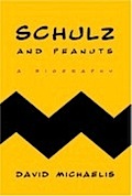 The Book Cover Archive is a compendium of the best of cover design, organized in some really useful ways. It’s the work of designers Ben Pierratt and Eric Jacobsen, and they’ve clearly put a lot of thought into the project. Not only can you search by authors, illustrators, and publishers, but also by designers, who are often the unsung heroes of a book’s success. (Don’t let anyone ever tell you people don’t judge a book by it’s cover.)
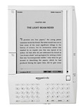 As an author, I am extremely interested in the idea of e-books and their impact on the future of publishing. Mandy Brown, a writer and designer, takes an interesting perspective on the issue: as long as we’re calling it an e-book, we’re kind of missing the point.
It’s a short, but very insightful essay on the history and future of the book as we know it.
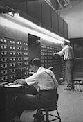 Once upon a time, every illustrator worth his or her salt kept a morgue file. The term comes from newspapers (who in turn swiped it from the coroner’s office) and it refers to the collection of files of reference material and back issues usually stored in the basement.
An illustration morgue file is an accumulation of images, often clipped from magazines and old books, that illustrators used for reference when they needed to know how to draw something. Morgue files were often accumulated over the course of a career, and they were messy and difficult to organize.
Nowadays, there’s little need to keep a traditional morgue file; the internet provides a much larger inventory than any individual collector could hope to amass. Listed below are some of the places I might go if I needed to draw, say, a horned lizard riding an old fashioned bicycle:
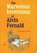 As a kid growing up in the 70’s, the Scholastic Book Club had a lot to do with helping build my enthusiasm for reading. (Was there anything better than the day the books arrived?) This Flickr group is a trip down memory lane for those of us who grew up during that time period. I remember quite a few of these, and there are many more that I want to find and read right now. I’m dying to know, for example, the mystery behind The Horse Without a Head.
As an illustrator, I also love what the artists of the day were able to accomplish given the limits of printing technology. So many of these images are just one or two-color jobs, but the small palette only seems to add to the appeal of the book. It’s a master class in how to do more with less.